
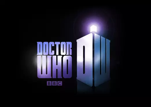
By the way, it’s interesting how all classic logos have the ‘Doctor’ stacked on top of ‘Who’, while all the modern logos have them side by side, except for the current one which is based on a classic one (and there’s a wider version of it as well).
10 Likes
Yeah, I noticed that too, I am pretty certain it has something to do with the Aspect Ratio. 4:3, which was the Standard for Classic gives you only limited Amount of Space to fill in, having a side by side Logo would probably feel a bit clunky really. So having it be stacked is the Way to go. Meanwhile, with the revived Show you have much more Space with the current Aspect Ratio and a lot more Space to fill in, so side by side is the Way to go really.
14 Likes
I think stacked logos are better generally.
7 Likes
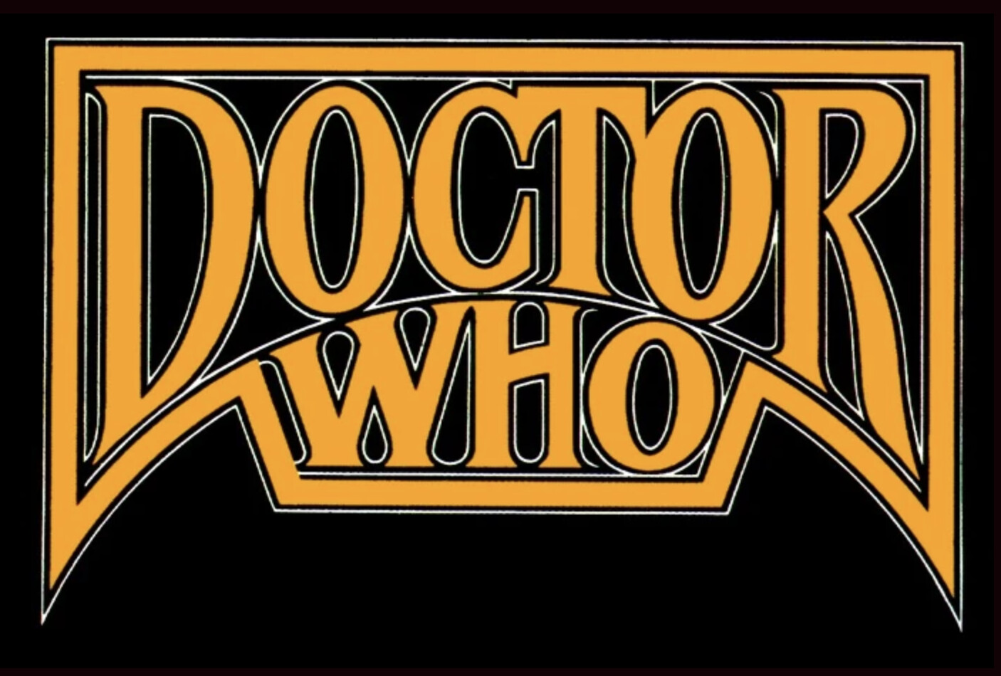
After the movie came out, it was sometimes referred to as The TV Movie With The Pertwee Logo (or something like that. It’s been a while).
9 Likes
I totally misread the title of this topic just now (despite having voted earlier today)
I read “What is your favourite Doctor Who Lego?” and thought for a moment I had missed an announcement for LEGO sets… ![]()
12 Likes
This makes a lot of sense when where you live is considered…
We get it. You invented the parent foot torture device.
13 Likes
Personally I prefer the horizontal Whitaker or DWARDIS ones, but only because when it comes to Big Finish covers, they don’t take up too much space. I feel like the current logo especially is just like a big intruding stamp which takes away from the new release covers. Rather just have ‘Doctor Who’, horizontally, at the bottom or at the top. Discreet, more like a border than a stamp.
7 Likes
Oh. As much as I love the return of the diamond logo. I hate how it looks in the horizontal version like you see on the spine of DVD/BD releases.
DOCTOR WHO
8 Likes
I’m the other way around. I like the horizontal version but just can’t stand the full diamond.
For me I’m most fond of the Jodie Whittaker era’s logo (very clean, looks nice on everything) and the 1980 logo (which, I grant you, I couldn’t see being put anywhere but Big Finish’s reverse covers today).
10 Likes
Nah. The diamond logo is fantastic. Original better, but I’m so happy to see the best logo ever return.
6 Likes

I went with the 1996 and the 2018 logos, they are both quite different, and I love all the different ways the 2018 was used. I also really like the 1987 one as well!
8 Likes
Same here,
Also have a lot of time for the 06-10 logo, as it was the time i grew up on who and remember it being plastered on everything
7 Likes
The 2018 logo is deeply silly to me. Thoctor Who (Ð is the th in this and then)
7 Likes
I chose the 1970 and 1996 ones (because they’re basically identical).
That’s the one I consider the primary Doctor Who logo, it’s incredibly simple but also utterly timeless and very versatile.
9 Likes
I do quite like the early Smith one but stacked (this was announced but then brushed under the carpet quickly in favour of the single-line version).
But the 1996 logo wins out.
6 Likes
I choose Secret Option: Pinnacle Books
Love that logo
4 Likes
Fits perfectly on the cover of the Goth Opera audio
6 Likes
It is not Doctor Whoy to me but it looks good!
4 Likes