
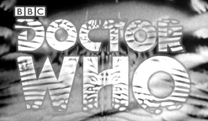
It really fits the early Tom Baker Era (I think that’s also where it was used for Books, I think?)
5 Likes
Yeah, they were on the cover of American reprints of target novels
4 Likes
Very pleased to see the 1996 logo winning the poll, because it is The Best One™. I love how blue it is, it just really screams “Doctor Who” to me somehow.
I also voted for the 1963, 2010 and 2014 logos. I think for me, it’s usually a case of simpler is better when it comes to this.
6 Likes
This is drawn from Logopedia (I recognize the red bubbles in the 2006 logo, which are the result of a malformed SVG file). [1] The differences are:
- 1996 and 1970 have slightly differently shaped C (angled/straight edges), T (same on the top right), and R (thinner curve at top right).
- 2007 has the bright lens flares under DO, the dot, and the final O.
- 2018 and 2021 are identical; it’s the BBC logo that’s changed.
I think the only difference between the 2012 logos (and indeed the 2011 one without the DW emblem) is the fill. 2013 seems to have a very slightly different C, with a bit of a bulge on the right side of the leftmost stroke.
Actually, my favorite is the 50th anniversary version of the 3rd/8th Doctor one, with the howlround effect:
I’ve actually contributed there a lot, including the Shalka and Nest Cottage logos! ↩︎
8 Likes