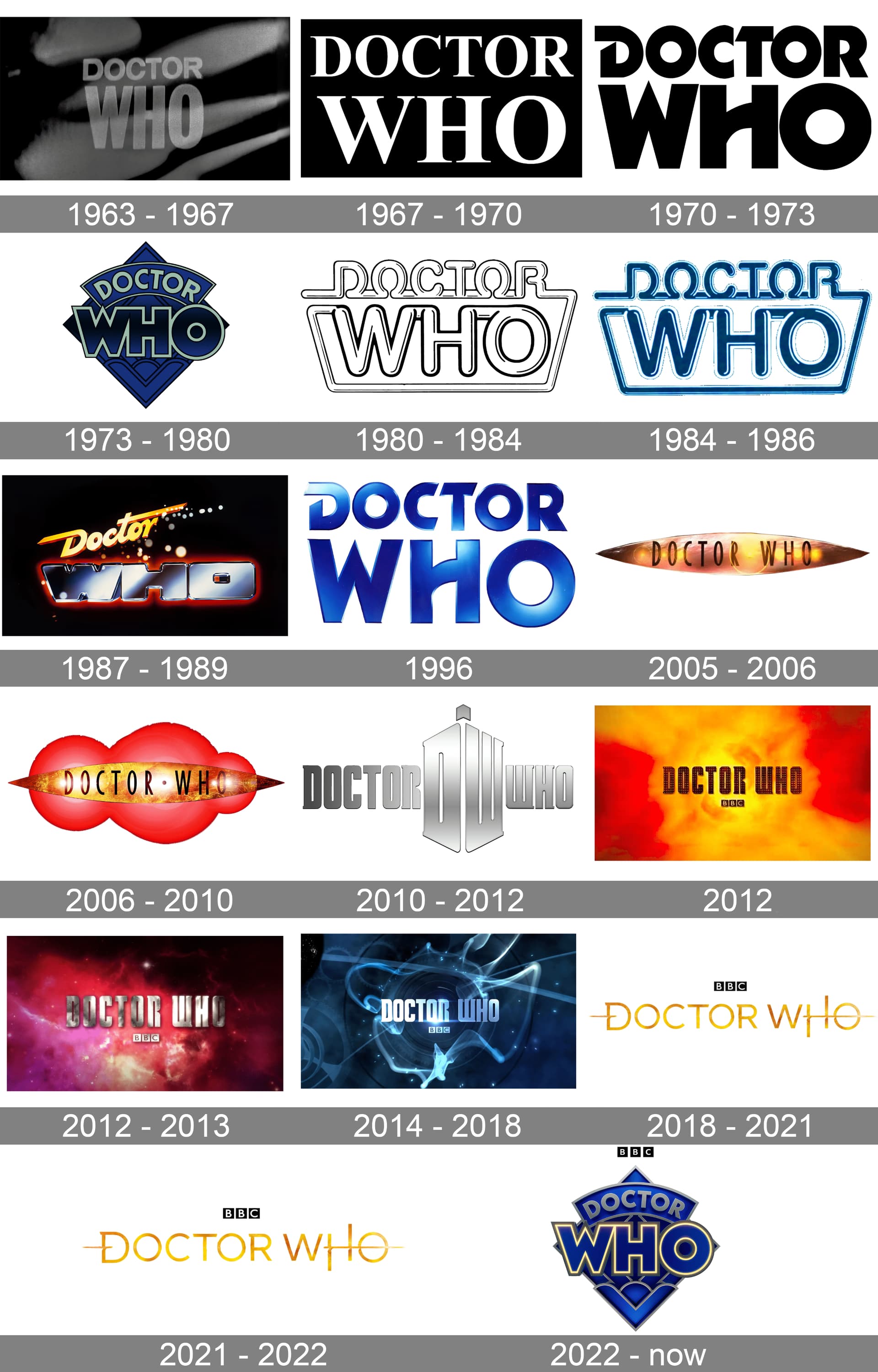
I know what will probably win out but I have to vote for the ones which are nostalgic for me - the neon logo and and McCoy (which I’ll probably be the only one voting for). I’m not a huge fan of any of the modern ones except the Chibnall era one. The ‘taxi cab’ logo and that horrible one with a DW TARDIS plonked in the middle from early Matt Smith are possibly my least favourite of all time.
As a Big Finish/EDAs fan the 1970/1996 logo is obviously my favourite <3
But I love a lot of the others. I genuinely love the 1987 logo—it’s so very 80s! And I was unsure about the 2018 logo to begin with but it really grew on me—I think it looks great on the audios and books, and I’m glad it’s still being used for the Blu-ray collections.
I love the Capaldi era logo, mainly due to nostalgia.
The 80’s tube logo is excellent, and The TV movie design is fantastic.
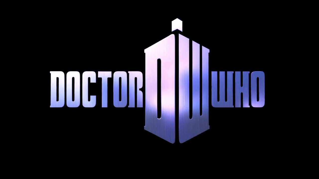
Obviously, the 2010 DW/TARDIS Logo is one of the best we’ve ever had
I think the TV Movie logo is my favourite, very pretty but very simple. But I will always have a fondness for the DW TARDIS, I just think it’s a really clever design.
Didn’t vote for it, but here’s a more accurate depiction of the Colin Baker era one. It’s more curved, and it’s purple, not blue.
So many good ones, actually hard to just pick four. I went with the original diamond, the fluorescent, the Capaldi, and the Whittaker. No idea what the difference is supposed to be between the two Whittaker ones.
I like the Pertwee logo/TV Movie logo. It’s timeless and simple. I also like the current diamond logo, which I find is a cleaner version of the original. I find the McCoy logo pretty ugly; it’s very much a product of its era (I don’t like the McCoy era title sequence either). The fiery Tennant era logo is quite nice as well, but looks a bit dated today.
The McCoy title sequence was probably great for the time considering the budget and level of CGI available, but I agree it doesn’t hold up as well now.
It’s so clever. The DW looks like a TARDIS, the little light on top I always imagine as Eleven’s fez as well and it’s handy to use just the DW glyph as a smaller logo.
It’s perfect. I love it. I wish they never dropped it!
No other show changes its logo so often. Do we think it’s a good thing? It can be fun, and distinguish eras, but also it can be a bit confusing, especially for stuff like Big Finish when they seem to use a random logo sometimes.
I am anti DWARDIS unfortunately. I think it’s fine as a standalone icon, but it’s totally DoctorDWWho stuck in the middle like that. I’m definitely in favor of changing up the logo every so often, usually by Doctor. Allows each era to have something to let it stand out, and is part of how this show continually evolves. I don’t think anything in terms of how expanded media uses the logos should be a determining factor on whether or not the show should change or update the logo. That said, it would be nice if other media or even ranges of physical TV media sold would either always use the logo corresponding to the era or Doctor it’s set in, or just always used the same logo for the same range. (Something I appreciate The Collection for doing).
Exaaaactly. Apart from that, the only thing I can think of in terms of a visual identity for DW as a brand is the TARDIS itself (which is inside the “DWARDIS” glyph) and the Seal of Rassilon. IDK, I think it’s nice to have a simple symbol to represent something, like Star Trek’s delta, for instance.