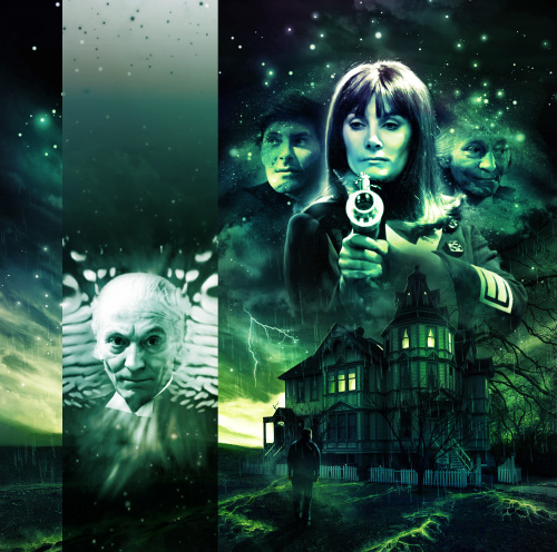
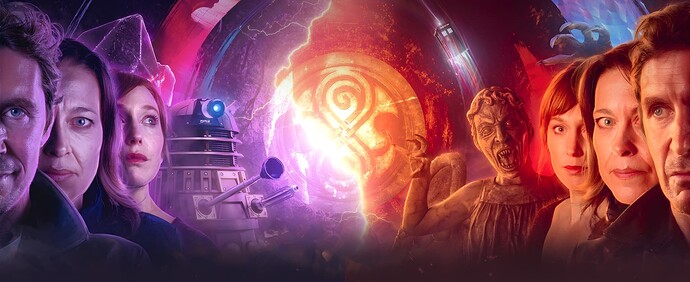
Welcome to the Big Finish Cover Art Gallery. Entry is free. Please be careful if you have food or drink with you, we don’t want to damage the artwork. I’m afraid the gift shop is temporarily closed for renovations.
What are some of your favourite cover art or artists working for BF. Going back to the beginning its noticeable how much the art has changed. How basic it was in the beginning & what we have now.
Also feel free to mention some of the worst, we can hang them in the gallery of shame 
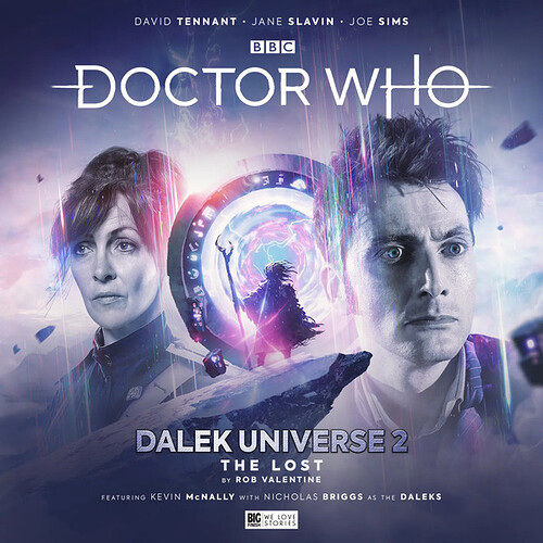
One of my favourites is The Lost by Simon Holub. A story from Dalek Universe.
18 Likes
Ooh nice thread. I have a huge folder of textless covers which I will at some point put on the site…
8 Likes
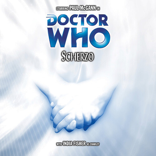
Scherzo is a definite favourite. So simple, so evocative, just like the audio itself.
Another one I love is Torchwood: Fall to Earth. Many of the Torchwood covers have these gorgeous swirling clouds in various colours for the background, but this one is especially beautiful.
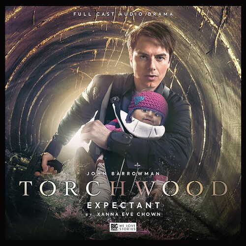
And a shout-out of shame to Expectant. The proportions are all wrong; his head his too big, his arms are all wonky, and I’m not sure what’s up with his torso and legs. And just look at that baby! Terrible all around. I love it.
18 Likes
I love so many Big Finish covers! My favourite is probably the Last Post, it’s so striking and melancholy:

Looking up that image sent me on o Companion Chronograph spree. Just look at Home Truths too!

17 Likes
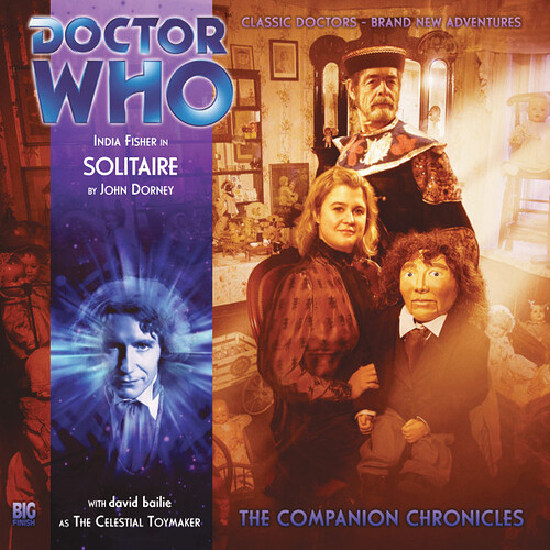
Puppet McGann on Solitaire always makes me laugh
19 Likes
Speaking of which, does anyone know why david bailie’s name is in all lowercase? It’s like that on the website too
9 Likes
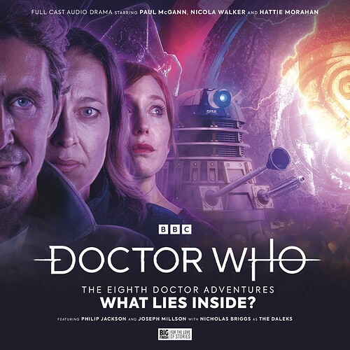
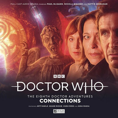
Personally I am a really big fan of the covers for What Lies Inside? and Connections. They line up so beautifully when put next to each other, and I always get a little dose of happiness when looking at it on my shelf.
Cover art was done by Rafe Wallbank !
12 Likes
Yeah I love those sets that line up! I made this by connecting the two textless versions - beautiful! (I have a bigger version as well, it’s huge)
22 Likes
Oh wow! I’ve never seen the connected version in that high a quality. Gosh, that’s stunning 
6 Likes
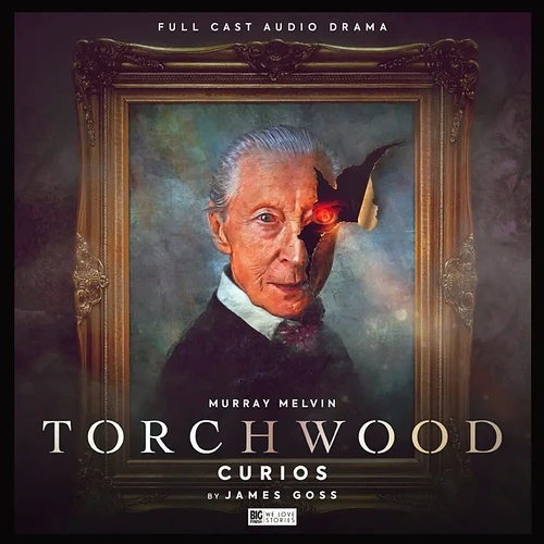
Most Bilis Stories have solid covers, but Curios especially is incredible
15 Likes
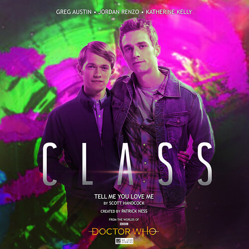
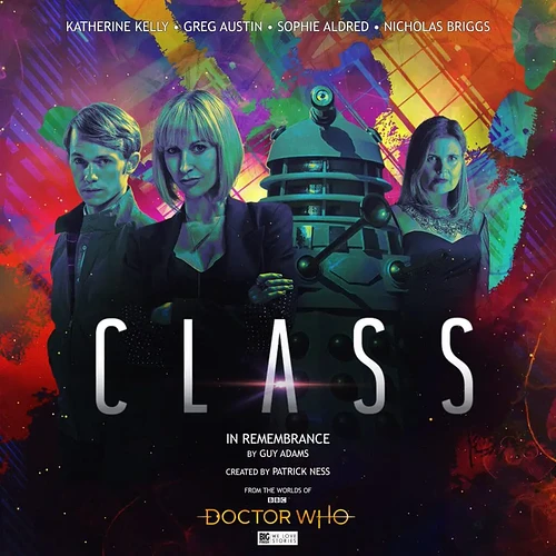
Also shout out to some of the the Class Audios, really captures the vibe of the show and the intro
(also Tell Me You Love Me is 5 star story, highly reccomend)
7 Likes
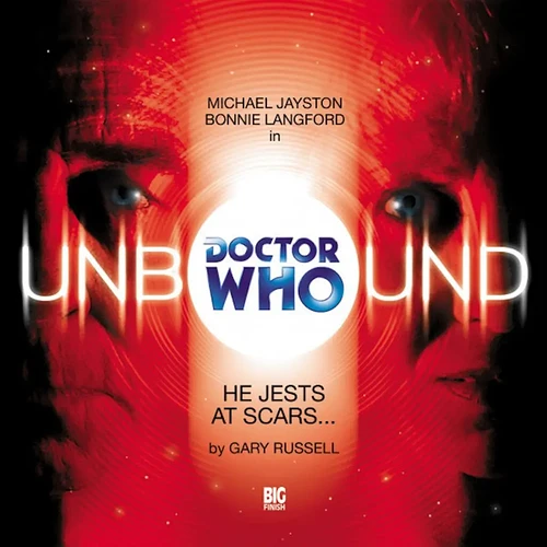
Last one, I promis, but I also adore the old Unbound Range Covers
8 Likes
It’s an affectation he uses - it’s like that on the credits of Pirates of the Caribben too, I believe.
3 Likes
Great cover:
…awful covers
I love this style sometimes but they overuse it a bit and use it for things where it shouldn’t be
13 Likes
the newly revealed cover for Deathworld is a thing of beauty imo, the Big Finish cover artists have been hitting it out of the park recently
25 Likes
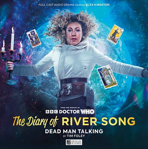
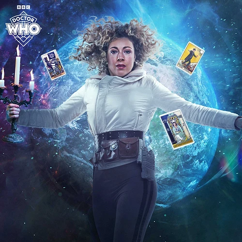
Real big fan of this one. Most of the River Song covers use stills from the show, so it’s nice to see a unique one. (this one currently isn’t on the site, hopefully will be soon though c:)
15 Likes
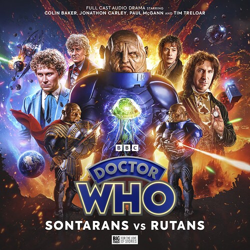
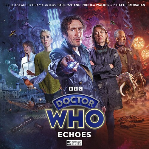
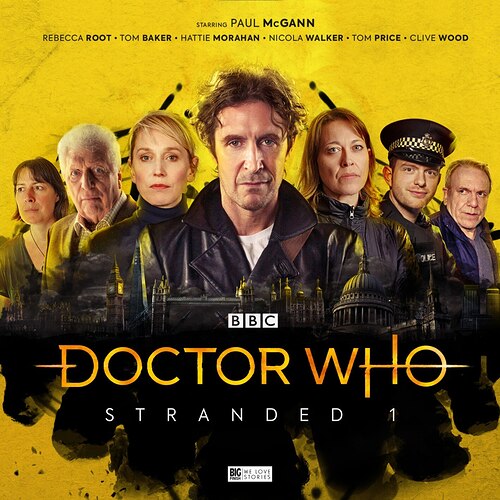
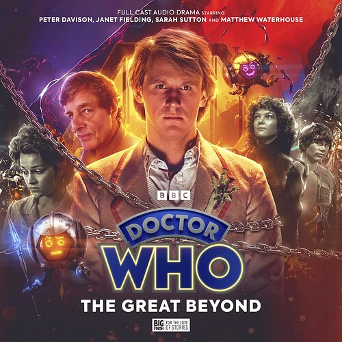
I’m sorry, but some of these give me Marvel poster vibes (i.e. just slap everyone important on the cover
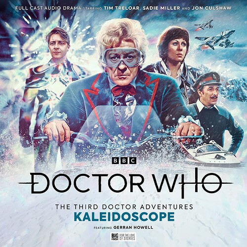
That said the Stranded style absolutely saves it and I love Kaleidoscope, it’s giving bond in the best way
9 Likes
There is a special part of the gallery, a hidden room where visitors emerge looking traumatised & visibly shaken. You will find art work like this in there 
20 Likes
![]()
