I just adore the warm lighting, the multiple levels, how eclectic the console is, it just feels like a place you’d actually want to hang out in, as well as just being very visually interesting. The glass floor, the varied sizes of “round things” on the wall, the staircases… ahhhhh I just love it so much. So pretty.
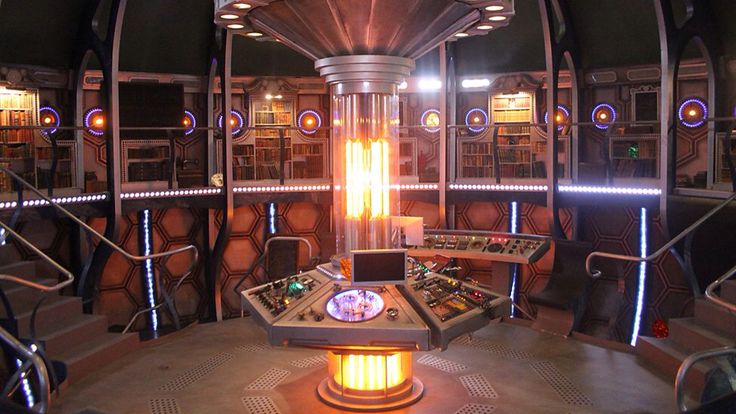
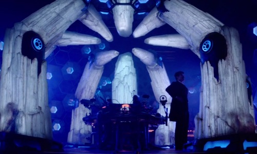
Although 12’s is very similar to 11’s second console, I absolutely prefer this one, the warm lighting and the bookshelves make it for me. Again I love a TARDIS with multiple levels and while it might not have as much of a homey feel as 11s, its still a nice space where you can sit and read a book. While not seen in this image I love the gallifreyan above the time rotor, and just in general that central glowing pillar is just gorgeous.
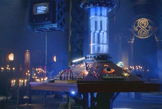
Rounding out my top three, the TV movie TARDIS!
Hard to even find a picture that captures just how huge this console room is. I absolutely adore it. The whole vibe is just amazing. The bookshelves the lighting the candles the armchair the rugs… I adore it so much. Only reason this isn’t higher is just because we only got to see it once (although to be honest, I’m not entirely sure how they would’ve used this set had the movie been successful in starting a new Doctor Who show, as I have zero idea if they could’ve had this set on a TV budget) but it worked wonderfully in the movie (which I do like! yeah it’s cheesy, but I adore it)
I love both 11 and 12’s TARDIS interiors, like you said it feels like a living place you could actually hang out in.
I love that there were doors leading out so you could imagine where they went easily.
I also have 12’s TARDIS as my “VR Home” on Steam VR so I sometimes visit it and imagine I am being whisked away into an adventure
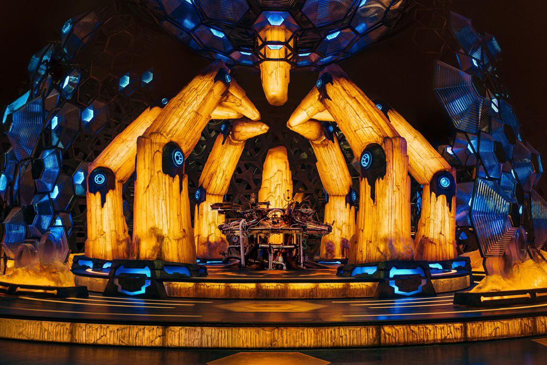
I really like 15’s new TARDIS, especially the lights! But I think it needs some more homely touches. We will see how it goes, love that he added a jukebox!
Agree on 11’s and 12’s as top 2, but 8’s always felt too much like they just plopped the console in the middle of a room. The new one is definitely a strong contender for 3rd place already, but I’m hoping it gets some more decor and really makes use of the walkways and different levels. 13’s is also high ranking for me.
I really really hope we get an episode where they explore the TARDIS, as when I saw the “next time” trailer for Journey to the Centre of the TARDIS I was SO EXCITED but then the episode itself I thought was a let down!
I know it’s unpopular but I really don’t get why haha! I absolutely love everything about 13’s interior. The colours are so warm and it just feels weirdly homely to me(maybe just because I love the era ?). I would add a second floor if I could though and maybe some more seating lol.
Also love eights, twelves and just any classic tardis tbf
I feel like this version suffers from being too cold and dark and generally kinda unwelcoming (which works really well for 11 when it’s introduced, but increasingly feels wrong as the season goes on). 12’s warms it up and makes it feel more welcoming and also putting the bookshelves and stuff on the top layer gives reason for characters to be up there more so it’s properly utilized more in that version.
Capaldi’s version is also hampered by the fact I have an aversion to the colours blue and orange mixing - I think that combination looks horrible anywhere!
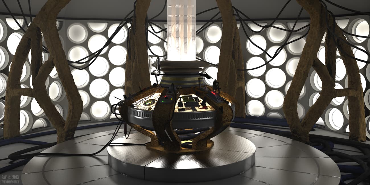
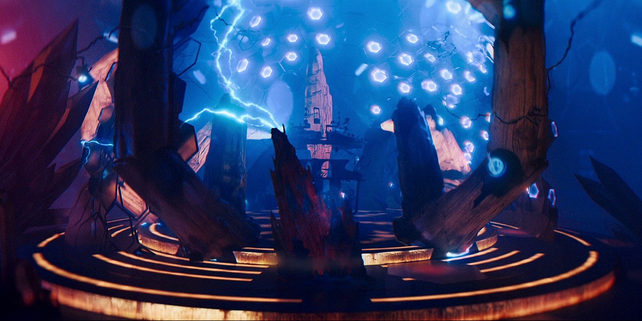
13’s is high up for me because I think the crystal look is just stunning, but I do think it suffers from not having the layers that the previous interiors had. It’s also always felt a bit to me like the console platform seems to just exist within a sorta void and you often don’t get a sense of there being more rooms beyond it
That was my issue with Thirteen’s TARDIS. The Crystals are beautiful but there was no sense of a living area (lots of awkwardly sitting on stairs) and no sense of it being much bigger on the inside.
Yeah the crystals forming a sorta cage definitely made it feel a bit small at times. And yes the blue lighting was great, as was the red danger lighting.
Yeah ultimately the reason that it’s not really firmly on the same level as 11’s or 12’s to me is that I think it works a lot better as a concept than as an actual set. I think if they kept the console platform design but had it in a larger room with some stairs heading off somewhere or something it could be nearly flawless
Yeah I agree. They definitely fixed some of the issues in Series 12 (staircase, a few extra doors and a small platform) but they weren’t utilised all that much. Flux was really good for it - I think that’s the only time we see the Doctor come in from another room haha. Felt a lot more spacious in Flux and the specials.