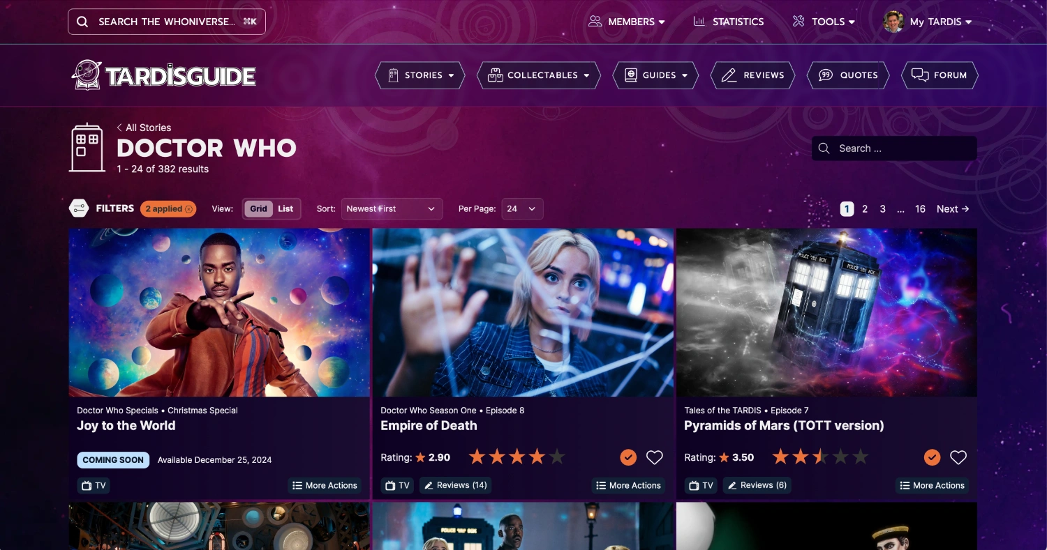
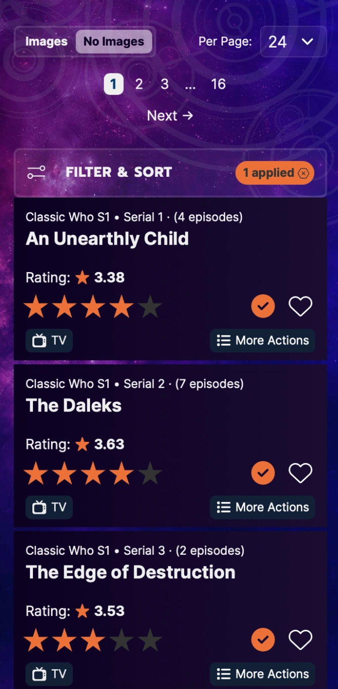
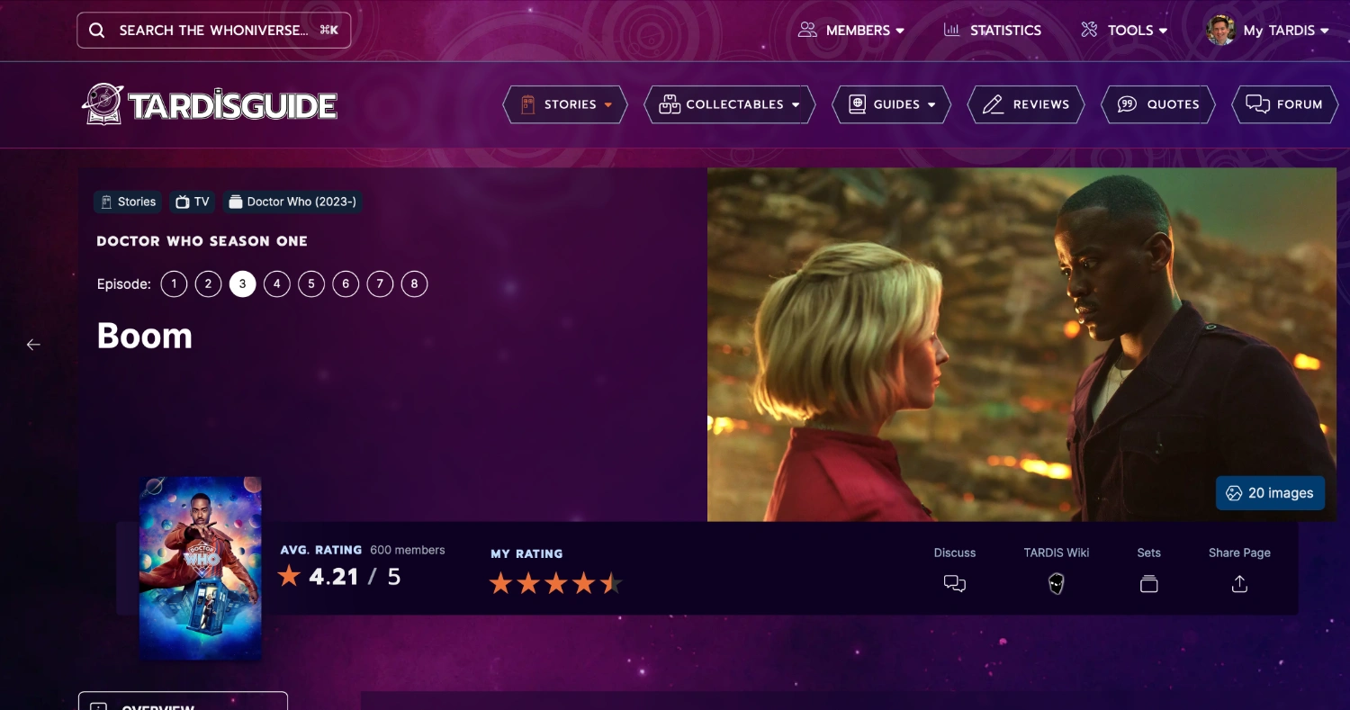
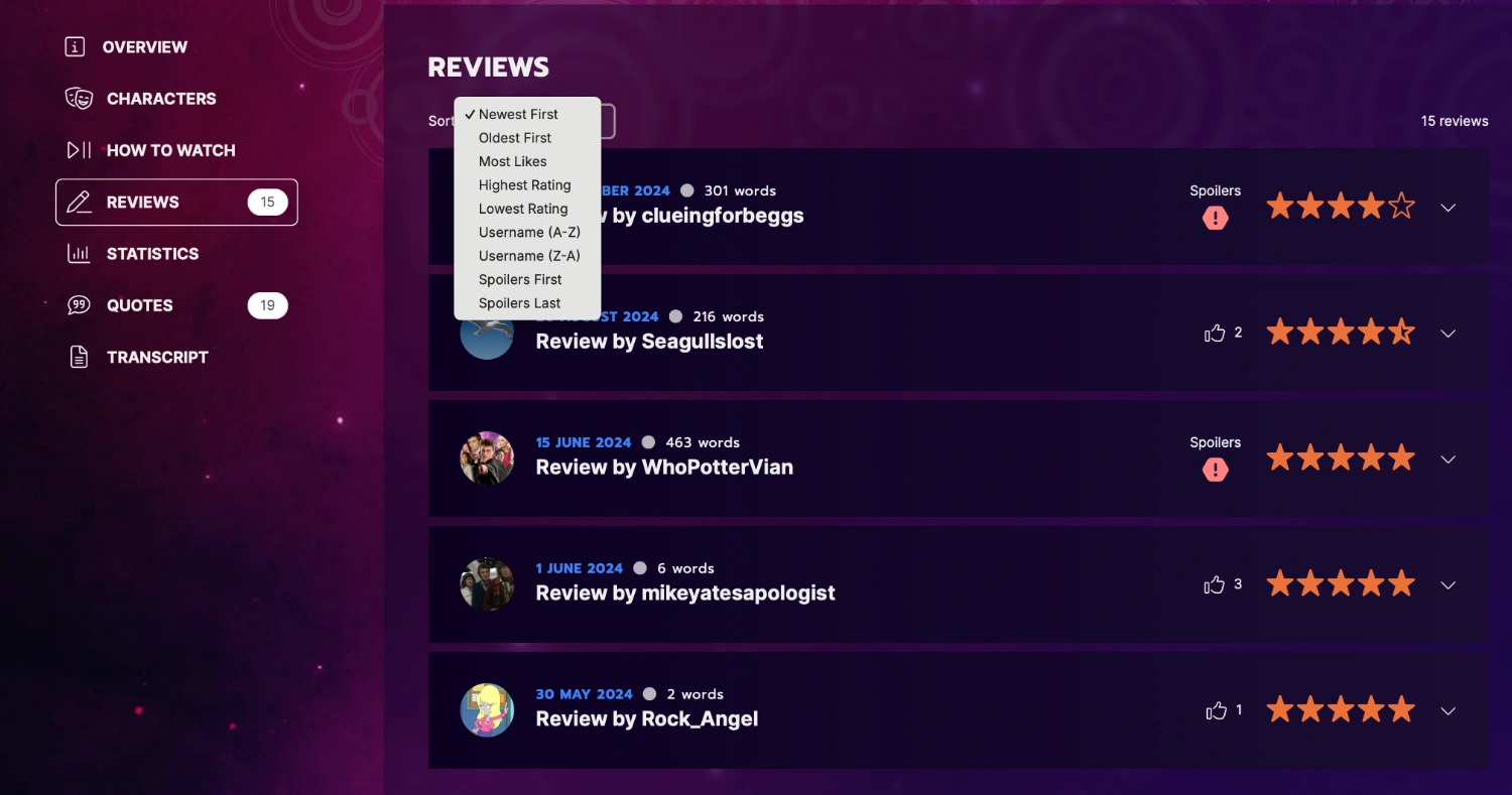
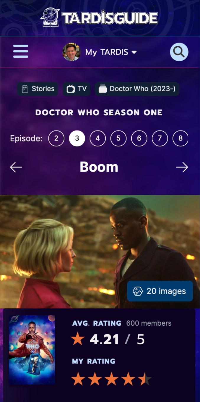
It’s the day after the Doctor Who Day weekend and I thought I’d give you one more treat - here are some screenshots of the brand new design for TARDIS Guide, which I’m hoping to launch before the end of the year…
Our Patrons are currently testing a live version of the site, and I still have quite a bit of work to do on it, but here is what we have so far!
Note that if you don’t like the colour, there will be a couple of themes to choose from, and a light/dark mode too!
Well done, you’ve done great work here! I find it a tad busy but I love the colours and the patterns in the background - you’ve managed to keep it looking very Who, so, well done on that too! Can’t wait to see it across the site!
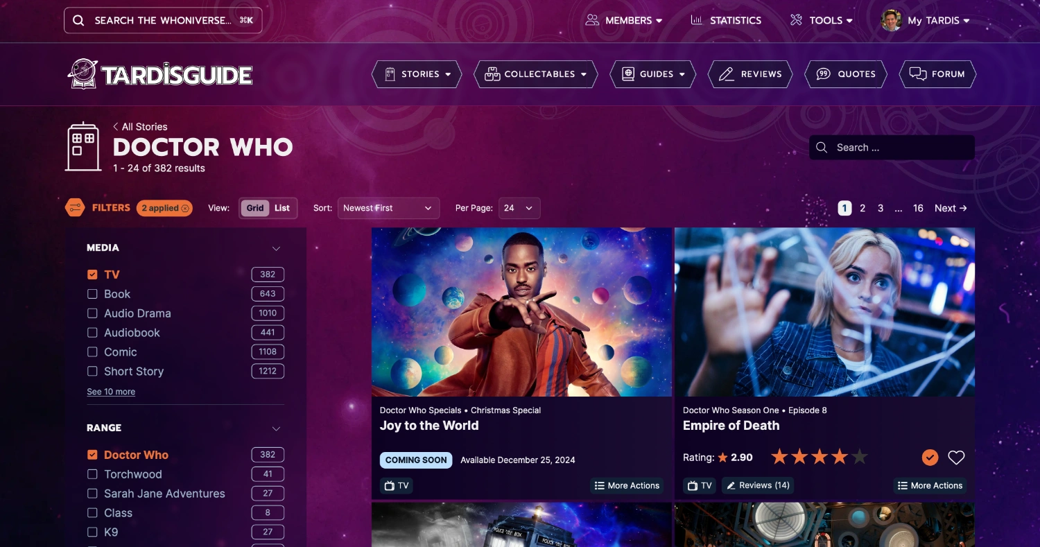
Wow, that looks really pretty! Do I see that right that you’ll be able to navigate to all stories in a set from the story page? If yes, that’s a really helpful feature
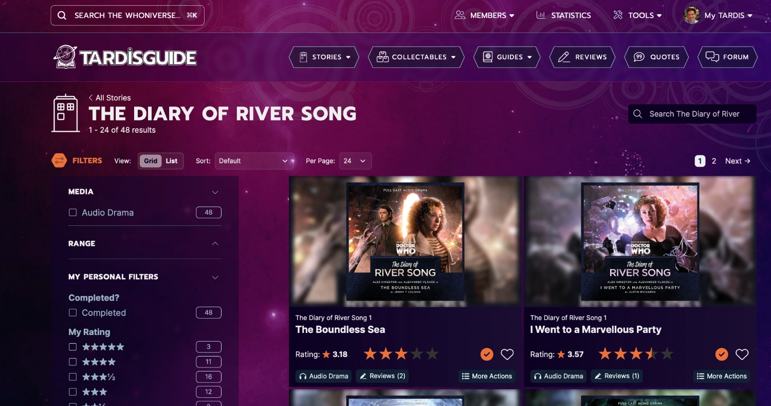
This is really lovely! The background is gorgeous and I love the set name banner. The story page will take some getting used to but I like it as-is I think! I’ll have to see it in action.
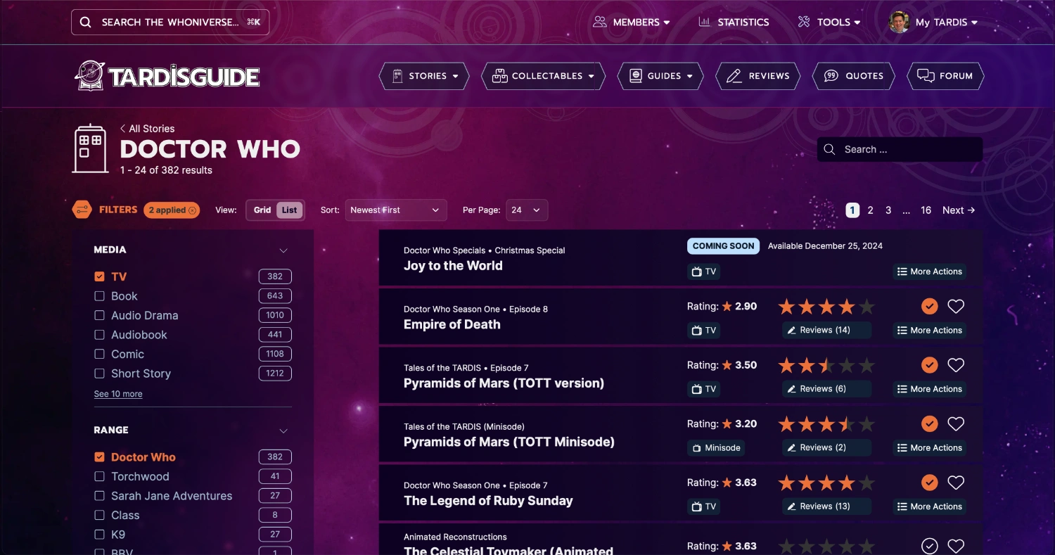
My main thought would be to allow an option to shrink the thumbnails on the set pages – I know I at least currently have the whole website slightly zoomed out so I can get three or four stories on a single row in set/search view.