Handles as the dot would be hilarious 
Thank you for your feedback. We did toy with a space between words. There were lots of iterations. We just liked this better.
I’ve added it everywhere now so not going to make any changes, but maybe we will tweak it in the future 
4 Likes
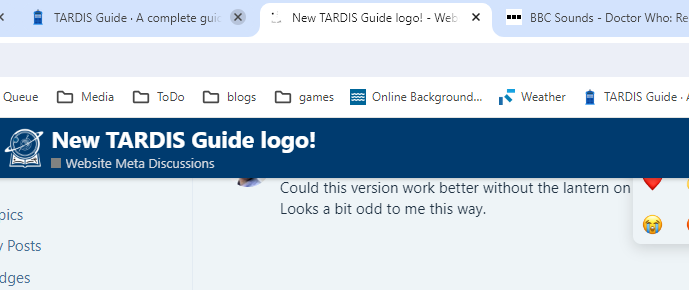
I love the new logo, but I’m not sure what you’ve done with the favicon is working. The old TARDIS one was distinctive and recognisable, but the new one looks more like specks of dust on the screen.
1 Like
Hmm it shouldn’t be transparent. I’ll take a look!
1 Like
Yeah, it’s the same with the icon for the Android home screen “app”.
I prefer it as is, without a dot or space.
1 Like
I’m not sure that’s the major issue. I think it’s the size-reduction algorithm which is skipping a lot of pixels. Did you design several images at different sizes, or just let the browser squish down a bigger one?
Should be fixed now. You may need to empty your cache to see it.
Edit: Not a huge fan of it being a square of blue. I’m going to see if it works better with black lines & transparent background…
Looks good. But it looks broken in the menu for me.
Yeah I just saw that… gonna leave it as white on blue for now 


